Accessibility in web design goes beyond compliance; it’s about creating inclusive digital experiences for all users, regardless of their abilities or limitations. By implementing accessibility best practices, you improve the user experience and boost your website’s SEO performance. This article delves into essential accessibility practices, explores key considerations like screen reader compatibility, touch targets, and alt text usage, and provides actionable insights to create a more accessible web.
Why Accessibility Matters
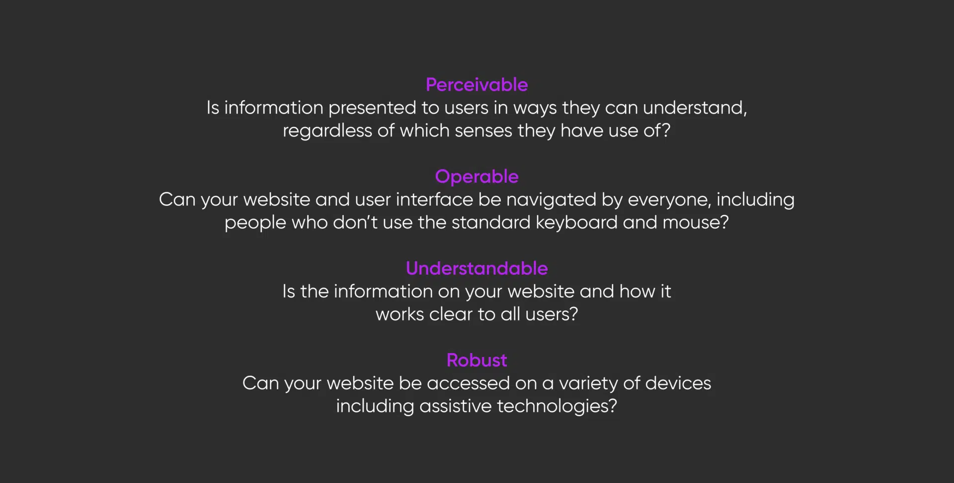
Accessibility ensures that everyone, including individuals with disabilities, can access, navigate, and interact with websites effectively. It encompasses visual, auditory, cognitive, and mobility impairments. By optimising your website for accessibility, you open up your content to a broader audience, improve usability, and comply with legal standards such as the Web Content Accessibility Guidelines (WCAG).
Heading Structure and Hierarchy
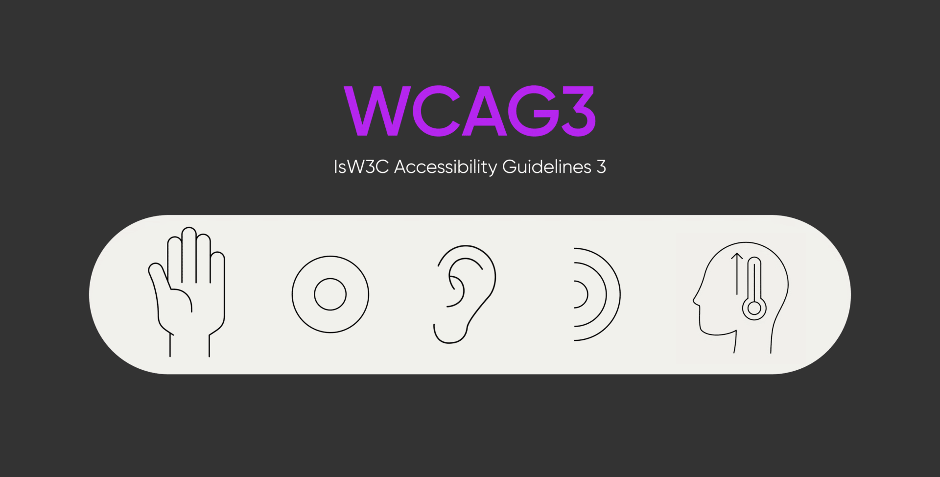
A key accessibility component is ensuring your webpage has a logical heading structure. Properly implemented headings (H1 to H6) help users, including those using assistive technologies, understand the organisation of the content on your page.
Why is Heading Structure Important?
A clear heading hierarchy enables users who rely on screen readers to navigate between sections quickly. Search engines also use headings to understand the context and hierarchy of your content, which helps with SEO.
Best Practices for Heading Hierarchy
- Use a Single H1 Tag: Every page should have just one H1 tag representing the page’s main title. This is essential for accessibility and SEO.
- Follow a Logical Sequence: Subsequent headings (H2 to H6) should follow a logical order. For example, under an H1, use H2 for primary sections, H3 for subsections, etc. This maintains a structured flow and enhances readability.
- Avoid Using Headings for Styling: Headings should only denote a section’s importance, not to achieve a specific text size or visual effect. Use CSS for styling rather than skipping or misusing heading tags.
- Descriptive Headings: Ensure your headings clearly describe the content that follows. For example, instead of generic headings like “Section 1,” use a descriptive heading such as “Understanding Heading Hierarchy for Accessibility.”
- Test Your Heading Structure: Make sure your headings are accessible to screen readers. Conduct accessibility audits or use screen reader tools to ensure users can quickly jump between headings.
By following these practices, you can create a clear content hierarchy that enhances both accessibility and user experience, ensuring that everyone easily navigates your content.
Key Accessibility Best Practices
- Using Appropriate Touch Targets and Responsive Design
Websites must be accessible on all devices and orientations. Some users may rely solely on landscape or portrait modes, so the design should not assume that users can easily switch between orientations. Ensure that all touch targets, such as buttons and links, are appropriately sized—at least 24×24 pixels—to accommodate users who rely on alternative input methods.
Tip: Test your website in portrait and landscape modes, and ensure all interactive elements are easy to select and activate.
- Screen Reader Compatibility and Proper Navigation Structure
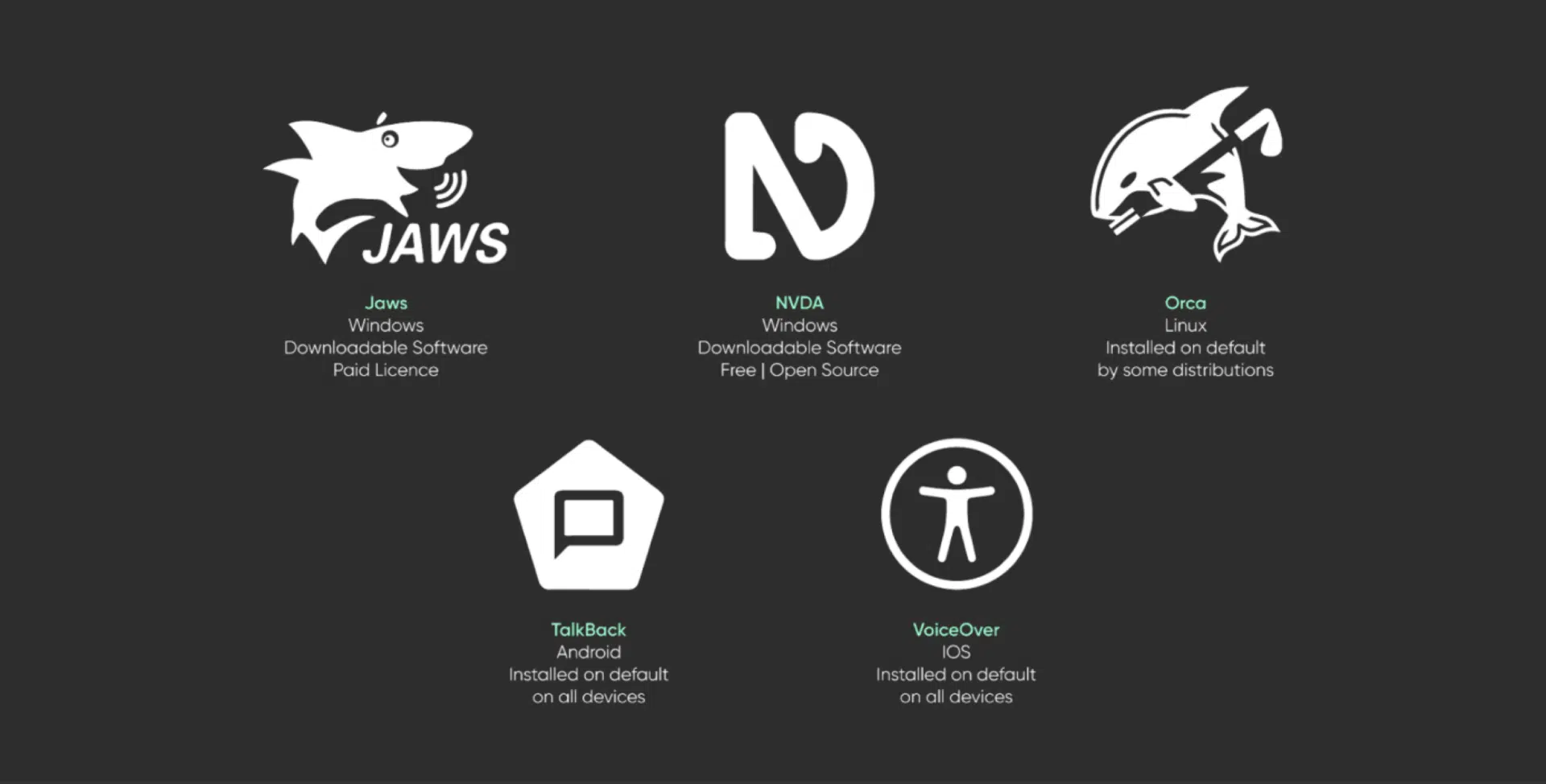
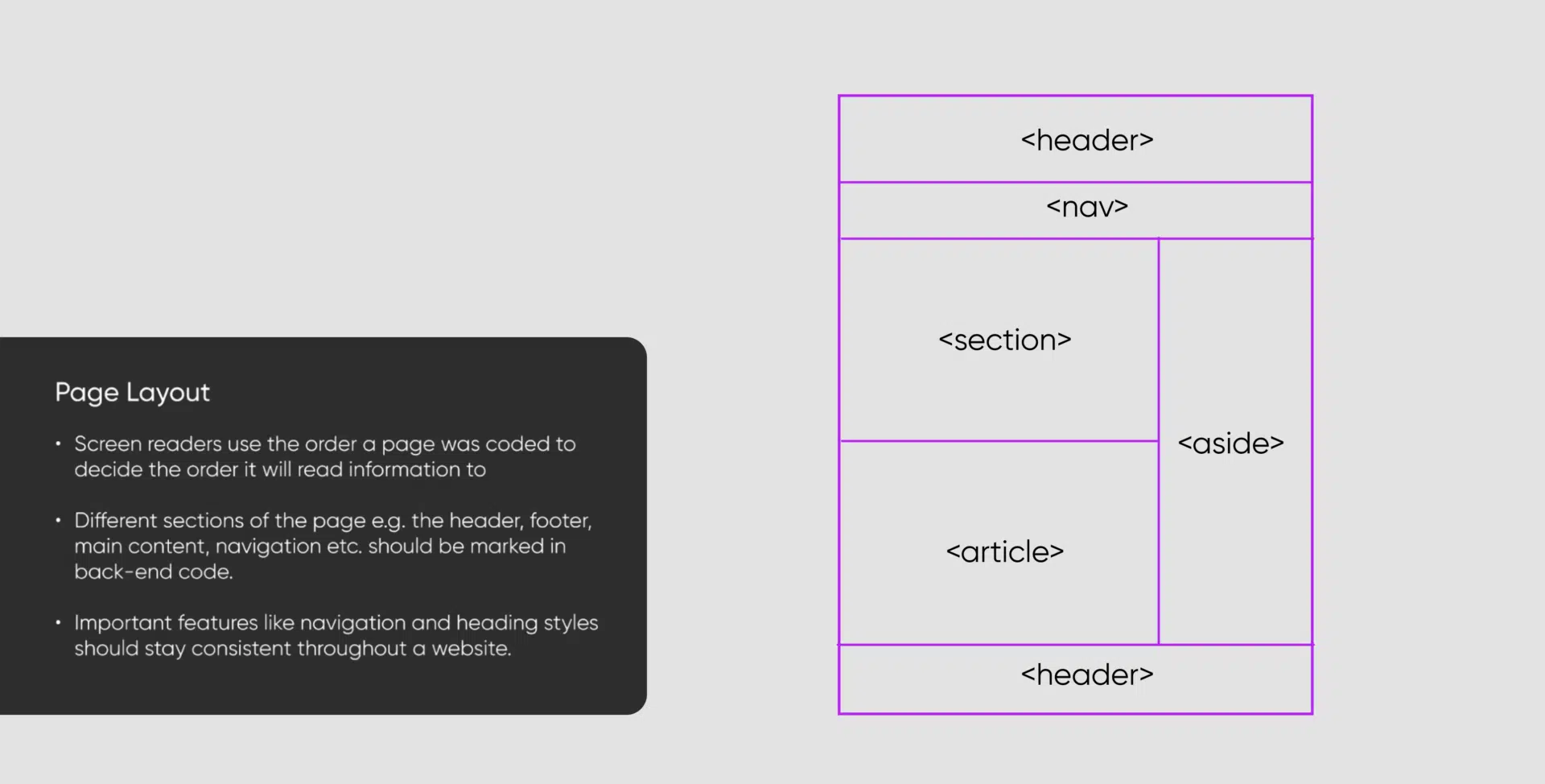
Screen readers, such as NVDA, JAWS, VoiceOver, and TalkBack, are vital tools for users with visual impairments. They convert text, images, and other elements into speech or Braille, enabling users to interact with websites. Ensure your website follows a logical structure with headings, lists, and semantic HTML for seamless navigation.
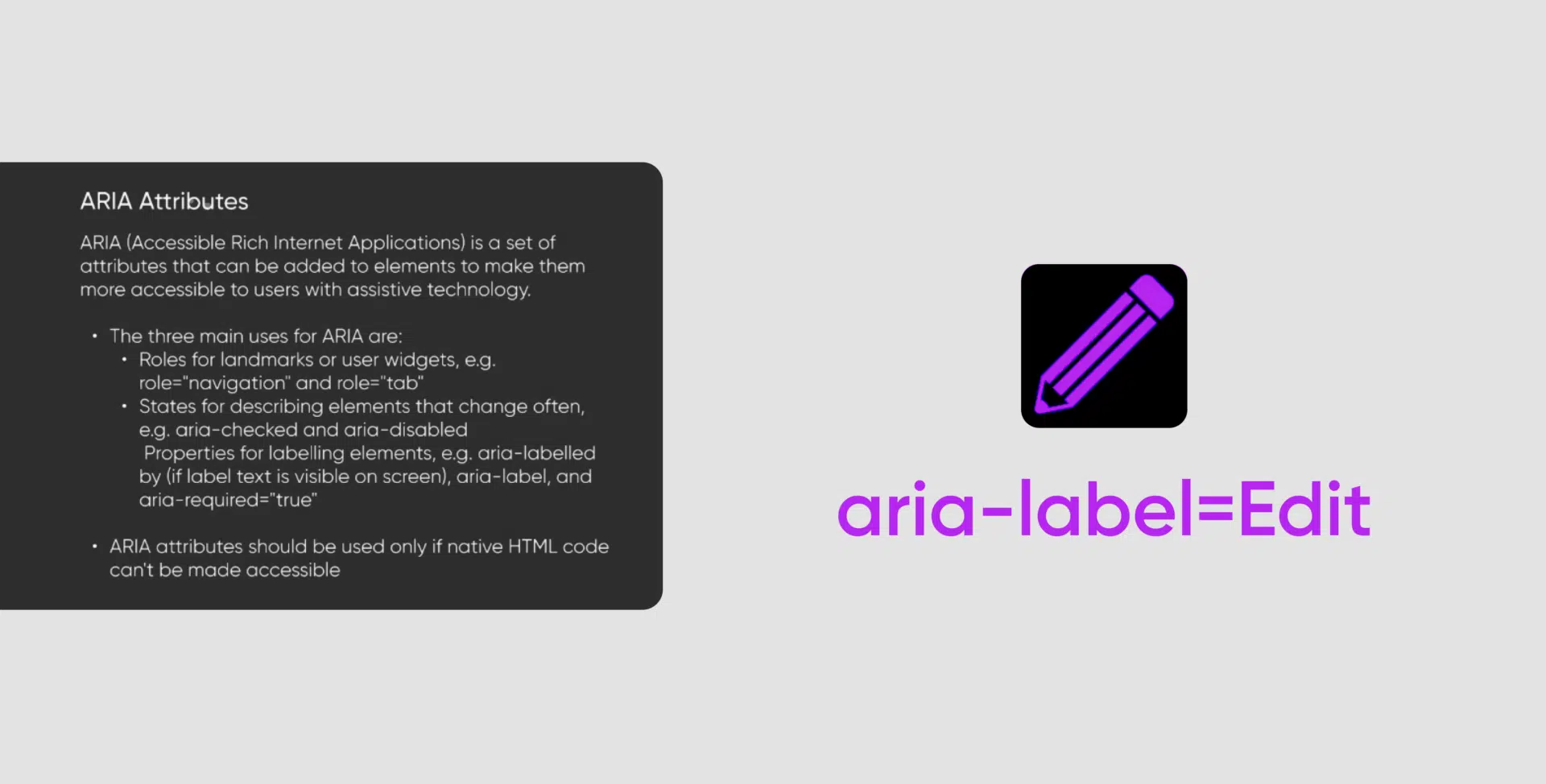
Additionally, implement ARIA (Accessible Rich Internet Applications) labels where needed. ARIA labels provide additional context for screen readers, improving accessibility for elements like buttons or forms. For example, instead of just “Read More,” an ARIA label could specify “Read more about SEO best practices.“
Tip: Regularly test your website with screen readers like NVDA and VoiceOver. Focus on navigation, headings, and alt text descriptions and ensure all elements are announced clearly.
- Optimising Alt Text for Images
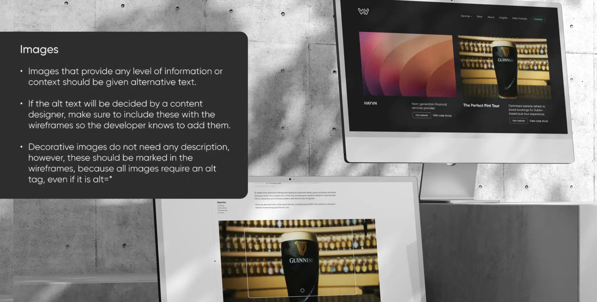
Alternative text (alt text) is crucial for both accessibility and SEO. For decorative images that don’t convey additional meaning, alt text can be omitted or marked as null. However, the alt text should accurately describe the image’s content without being overly detailed unless necessary for informational images. For example, a photo showing a family picnic under a tree could have alt text like “A family having a picnic under a tree,” which provides sufficient context without unnecessary specifics.
Tip: Use concise, descriptive alt text for images, avoiding redundant details unless relevant. Alt text should be meaningful and provide context for the image’s purpose on the page.
- Creating Accessible Forms and Components
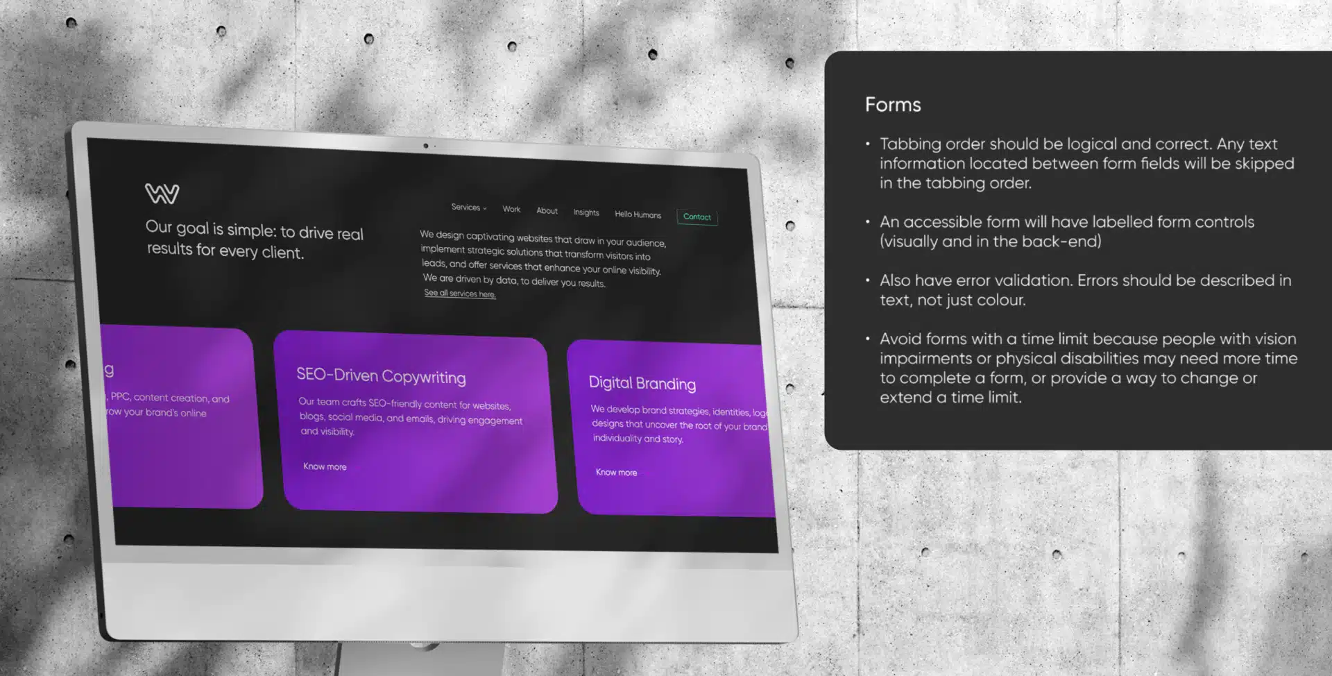
Forms are crucial to website interaction, so they must be accessible. Consider using accessible plugins like Gravity Forms, which offer better accessibility features than others. Ensure that every form field has clear labels, and use ARIA attributes where necessary to describe the form’s purpose to assistive technologies.
Tip: Avoid pop-up elements that can block access to the rest of the page. If pop-ups are used, ensure they are accessible and don’t trap users.
- Implementing Responsive Design with Accessible Units
When designing for accessibility, it’s vital to avoid fixed pixel sizes and instead use relative units like rems or ems. This approach ensures that content scales appropriately when users adjust their browser settings or zoom in on the page.
Additionally, enables reflow to avoid horizontal scrolling, which can be challenging for users with limited mobility or cognitive impairments. If horizontal scrolling is necessary, such as in data tables, ensure users are informed and can easily navigate the content.
Tip: Test your website at 200% zoom to confirm all elements remain readable and well-organised.
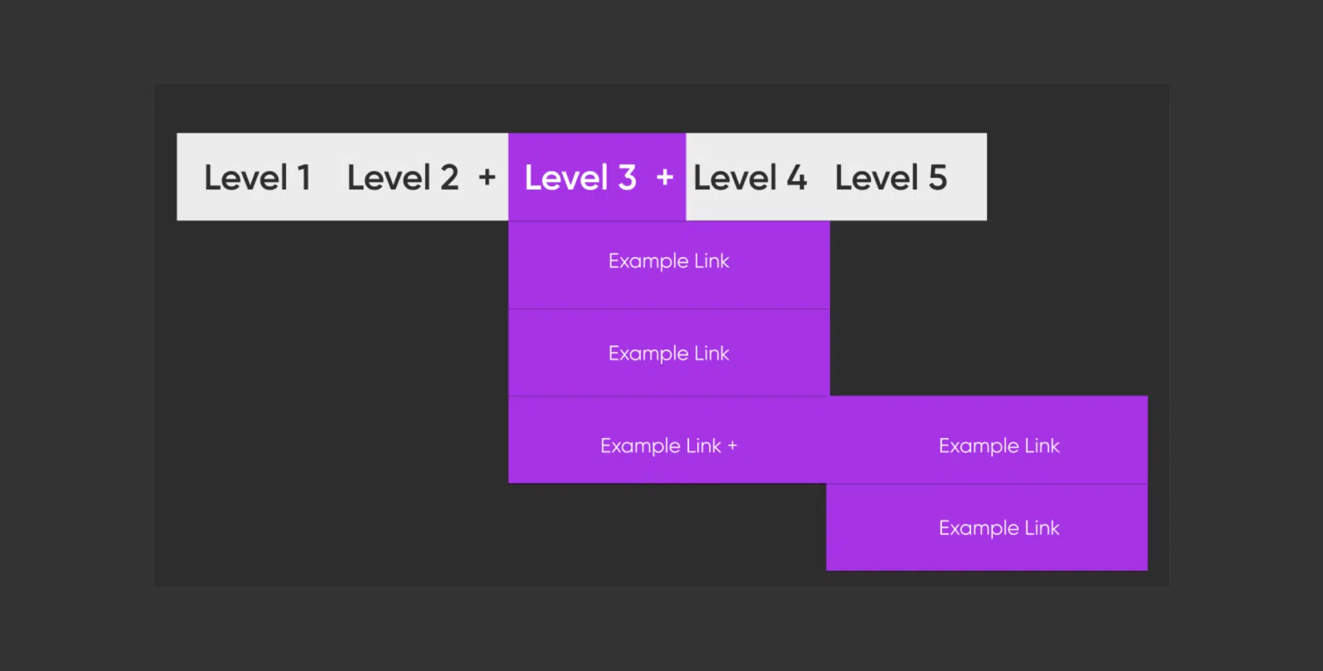
Menus that expand on mouse hover should also expand when activated with a keyboard.
A labelled button can be implemented so keyboard-only, and screen reader users can open and close the menu. The button can also act as a visual indicator that a submenu exists.
Users shouldn’t be forced to move through every item in a navigation menu unless they choose to.
An invisible skip link should be placed before the navigation menu.
Carousels
Carousels, also known as slideshows or sliders, can be very difficult to make accessible. If these carousels move automatically, they need to include pause/play buttons, as without this feature may be disorienting to people with disabilities.
At the same time, accessibility-friendly carousels need to be available to keyboard-only users and have clearly labelled navigation buttons.
Users should not be forced to move through every item in a carousel unless they choose to do so.
Tables
If we want to include tables in our content, the most important aspect to make them accessible is to make them simple.- Complex tables should be divided into individual tables.
When the table is made, table rows, headers, and data cells must be defined. We need to facilitate the work of screen readers so users can hear one cell at a time, and the data cell must be associated with its respective header cell to give it the correct context. It also helps sighted users if the header and data cells look different visually by using a secondary colour background or bold font in the header cells.
Finally, cells should be used wisely, not as a layout element. In that case, working with CSS is always a more accessibility-friendly solution.

Colour Contrast for Accessibility
- The contrast between text and background should meet Web Content Accessibility Guidelines (WCAG). The average ratio should be at least 4:5:1 for standard text, and for large text (18pt or 14pt bold), the minimum ratio is 3:1.
- Ensuring adequate contrast makes content accessible to users with visual impairments, such as colour blindness or low vision, improving their readability and usability.
- Avoid relying solely on colour to convey information, such as red text for errors, and ensure additional visual cues like text labels, titles or icons intended to provide context for users who may have difficulty distinguishing colours.
Incorporating Accessibility into Video and Audio Content
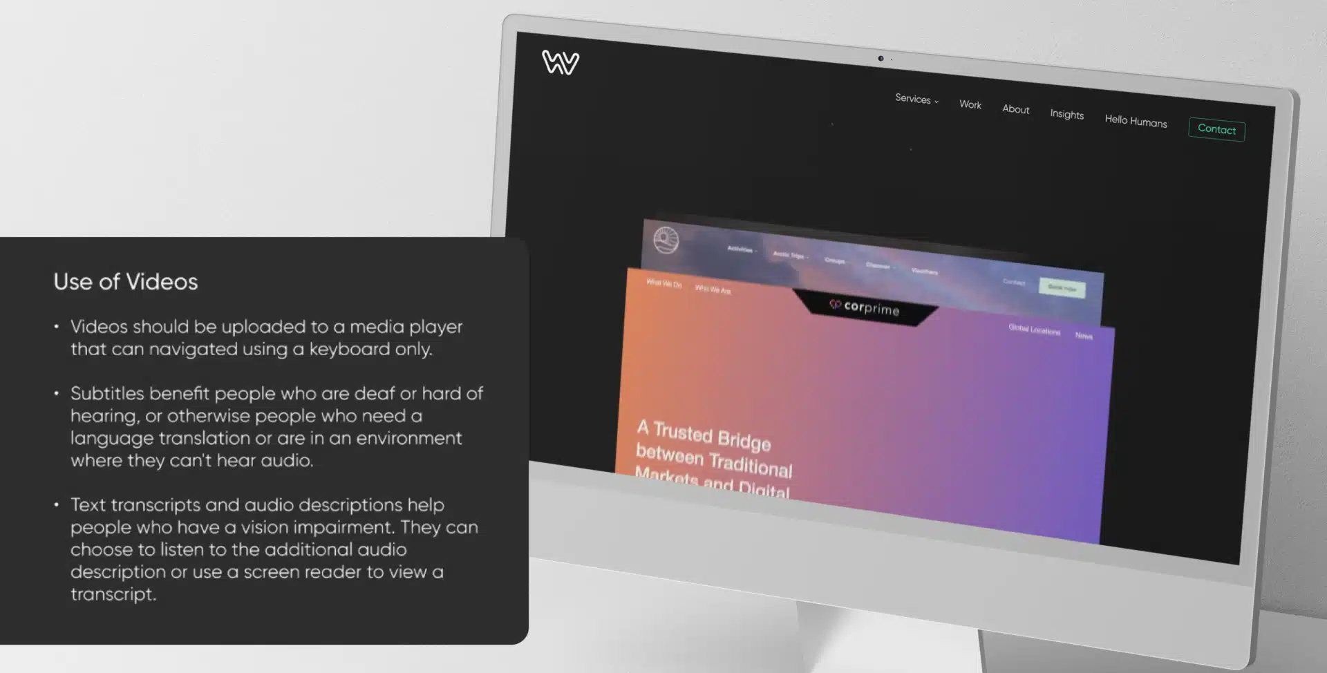
Videos should include transcripts and captions to provide users with hearing impairments access to the content. For purely decorative videos, such as background loops, consider whether they require transcripts based on the impact of the content. For example, an interview or instructional video must include a full transcript and ideally offer closed captions.
Tip: Leverage AI tools to automate transcript creation and review them for accuracy to ensure that captions and descriptions align with the visual content.
Tools and Testing for Accessibility
Integrating accessibility testing into your workflow is essential. Tools like WAVE, Axe, and Lighthouse can help identify common accessibility issues. Manual testing using screen readers and real-world device orientations is crucial to understanding how users interact with your website.
Tip: Establish a standard accessibility testing routine, including automated tools and manual checks using screen readers and different device orientations.
Conclusion
Creating an accessible website is an ongoing journey, not a one-time task. Following these best practices can make a more inclusive user experience, improve your website’s SEO, and comply with accessibility standards. Remember, accessibility is about putting users first and recognising that inclusive design benefits everyone.
Ready to make your website more accessible? Start implementing these practices today to create a user-friendly and inclusive digital experience.
Accessibility Best Practices Q&A
Website accessibility ensures that web and digital content are accessible to all users, including those with disabilities. It’s important because it enhances the user experience, increases your website’s reach, improves SEO, and helps comply with legal standards like the WCAG (Web Content Accessibility Guidelines).
Optimising alt text provides context for users who rely on screen readers by describing images and their purpose. It also improves SEO by allowing search engines to understand your content better. Remember to keep alt text concise and relevant.
ARIA (Accessible Rich Internet Applications) labels provide additional context to assistive technologies about the purpose of a web element. They are used when native HTML elements, like providing additional information for buttons, forms, or dynamic content, can't fully describe an element's role or function.
Touch targets should be at least 24x24 pixels to accommodate users with mobility impairments or those who rely on alternative input methods. Properly sized touch targets ensure users can easily select and activate interactive elements, improving accessibility and usability.
Responsive design adapts content to different screen sizes and orientations, enhancing accessibility users. It ensures that websites remain usable and easy to navigate, even for users who rely on specific screen sizes, zoom levels, or device orientations like portrait or landscape.
Screen readers convert digital content into speech or Braille, helping users with visual impairments navigate websites. Popular screen readers include NVDA (free for Windows), JAWS (paid for Windows), VoiceOver (pre-installed on Apple devices), and TalkBack (pre-installed on Android devices).
Videos should include closed captions and transcripts to make them accessible to users with hearing impairments. Descriptive audio or alternative text should be provided for visual elements, ensuring all users can understand the content, regardless of their abilities.
Using relative units like rems or ems ensures that content scales appropriately when users adjust their browser settings or zoom in. This improves readability and accessibility, allowing users with visual impairments to customise their viewing experience without losing functionality or clarity.
Screen readers rely on semantic HTML, ARIA labels, and keyboard navigation to interpret and announce web content. To optimise your pages, use clear heading structures, descriptive labels, and skip navigation links to help screen reader users quickly find and understand content.
Use automated testing tools like WAVE, Axe, and Lighthouse to identify common accessibility issues. Howe also manually tests with screen readers like NVDA or VoiceOver and checks your website in various device orientations and zoom levels to ensure a comprehensive approach to accessibility.